Layouts & Styles
Sphinx-Needs provides functions to manipulate the layout and the style of a need.
Layouts are defined by a preconfigured table grid and the data, which shall be shown inside specific grid cells. Styles define mostly the color of a need.
Both features can be set directly during need-configuration or inside the sphinx conf.py file.
Sphinx-Needs provides some preconfigured, ready-to-use standard layouts:
clean
complete
focus
Layouts
Layouts are using a predefined grid system and define which data shall be shown in which grid-cells.
There can be multiple layouts using the same grid system, but maybe showing different data. E.g. a layout for bugs and one for specifications.
Sphinx-Needs comes with some predefined layouts. But the user is free to create own layouts and use only them.
Most useful layouts are:
Layout |
Used grid |
Comment |
|---|---|---|
clean |
The standard Sphinx-Needs layout |
|
complete |
Divided head, meta, footer rows. Showing really all user-added data. |
|
focus |
Content focused layout. Showing content only. Nothing more. |
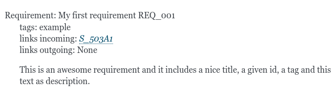
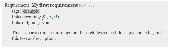
Examples
This is a need using CLEAN layout. |
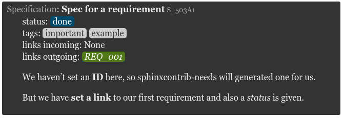
COMPLETE layout
|
Requirement
|
||||
This is a need using COMPLETE layout. |
|||||
This is a need using FOCUS layout. The same meta is set as the two needs above. |
There are also some extensions for the layouts above available:
Layout |
Used grid |
Comment |
|---|---|---|
clean_l |
Like |
|
clean_r |
Like |
|
clean_lp |
Like |
|
clean_rp |
Like |
|
focus_f |
Adds a small footer below content with the need id. |
|
focus_l |
Adds a small footer to the left side of content, showing the need id. |
|
focus_r |
Adds a small footer to the right side of content, showing the need id. |
The layouts clean_l, clean_r, clean_lp and clean_rp are using the value from the field image as
source for the image in the side element. This field must made available via needs_fields.
If you need another field as source, you must create your own layout.
Examples
 |
|
This is a need using CLEAN_L layout. |
|
|
This is a need using CLEAN_R layout. |
|
|
This is a need using CLEAN_LP layout. |
|
|
|
This is a need using CLEAN_RP layout. |
|
This is a need using FOCUS_F layout. |
This is a need using FOCUS_L layout. |
This is a need using FOCUS_R layout. |
Special layouts:
Layout |
Used grid |
Comment |
|---|---|---|
debug |
Shows all meta data (also internal ones). Useful do see what data is available for a need and which can be used in Filter string. |
Examples
EX_DEBUG DEBUG layout
|
This is a need using DEBUG layout. |
Using layouts
There are two ways of setting a layout for a need:
Set it globally via needs_default_layout in your conf.py file:
# conf.py
needs_default_layout = 'complete'
Or set it locally for each need by using layout option:
.. req:: My requirement
   :layout: complete
Defining own layouts
Own layouts can be defined by using the the config parameter needs_layouts in your conf.py file.
needs_layouts must be a dictionary and each key represents a layout. A layout must define the used grid-system and
a layout-structure. Example:
needs_layouts = {
    'my_layout': {
        'grid': 'simple',
        'layout': {
            'head': ['my custom head']
            'meta': [ 'my first meta line',
                      'my second meta line']
        }
    }
}
The layout-structure must also be a dictionary, where each key reference an area in the used grid system.
By default these can be: head, meta, footer and more.
If the layout-structure is using a not supported key by the current grid-system, the entry gets ignored.
E.g. grid simple is not supporting footer area.
The values of a specific layout-structure area definition must be a list, where each entry must be a string and represents a single line in the later need representation. This line can contain Layout functions, which care about getting need-data or adding links.
Note
Sphinx-Needs provides some default layouts. These layouts can not be overwritten. See layout list for more information.
Note
The content area of a grid can not be overwritten. It is always there and can’t be changed or replaced.
Layout line
A layout line may look like this:
**style**: my_<<meta('status')>>_style
This line contains:
a rst text, which supports common inline roles (bold, italic):
**style**: _my_a layout function, which gets executed and returns a string:
<<meta('status')>>another rst text:
_style
When executed, the line will result in the following for a status like open:
style: my_open_style
You can combine as many Layout functions and text elements as you want for a line.
The head-line for the default Sphinx-Needs layout clean looks like this:
<<meta("type_name")>>: **<<meta("title")>>** <<meta_id()>> <<collapse_button("meta", collapsed="icon:arrow-down-circle", visible="icon:arrow-right-circle", initial=False)>>
You are free to surround a layout function with a rst role. Like **<<meta("title")>>** to get a bold printed title.
Sometimes an argument for a layout function shall be based on a given need option. In this cases the option name
can be surrounded by {{ .. }}.
As example, there may be an author option in a bug-need and you want to show a picture of the author in the grid
simple_side_right_partial.
The line for the side area could look like:
'<<image("_images/{{author}}.png", align="center")>>'
My test spec for
|
 |
This example shows an image based on the The used layout takes the value from |
|
Here is the complete used code
# conf.py
# -------

# Make the author option valid
needs_fields = {"author": {}}

# Define own layout
needs_layouts = {
    'example': {
        'grid': 'simple_side_right_partial',
        'layout': {
            'head': ['**<<meta("title")>>** for *<<meta("author")>>*'],
            'meta': ['**status**: <<meta("status")>>',
                     '**author**: <<meta("author")>>'],
            'side': ['<<image("_images/{{author}}.png", align="center")>>']
        }
    }
}
rst-code of the above need
--------------------------

.. spec:: My test spec
   :author: daniel
   :status: open
   :layout: example
   :tags: example
   :style: yellow, blue_border
Layout functions
To get custom data into your layout the usage of layout function is needed.
A layout function may look like <<meta(arg1, arg2, kwarg=data)>>
Available layout functions are:
- meta(name, prefix=None, show_empty=False)
Returns the specific metadata of a need inside docutils nodes. Usage:
<<meta('status', prefix='\*\*status\*\*: ', show_empty=True)>>
Note
You must escape all rst_content in your function strings! E.g. to get ** one must use \*\*.
- Parameters:
name – name of the need item
prefix – string as rst-code, will be added infront of the value output
show_empty – If false and requested need-value is None or ‘’, no output is returned. Default: false
- Returns:
docutils node
- meta_id()
Returns the current need id as clickable and linked reference.
Usage:
<<meta_id()>>
- Returns:
docutils node
- meta_all(prefix='', postfix='', exclude=None, no_links=False, defaults=True, show_empty=False)
meta_all()excludes by default the output of:docname,lineno,refid,content,collapse,parts,id_parent,id_complete,title,is_part,is_need,type_prefix,type_color,type_style,type,type_name,id,hide,sections,section_name.To exclude further need-data, use
exclude, likeexclude=['status', 'tags']To exclude nothing, set
defaultstoFalse.Usage:
<<meta_all(prefix='\*\*', postfix='\*\*', no_links=True)>>
Note
You must escape all rst_content in your function strings! E.g. to get ** one must use \*\*.
- Parameters:
prefix
postfix
exclude – List of value names, which are excluded from output
no_links – excludes all incoming and outgoing link types from output
defaults – If True, default excludes are added. This filters out all internal data, which is normally not relevant for the user.
show_empty – If true, also need data with no value will be printed. Mostly useful for debugging.
- Returns:
docutils nodes
- meta_links(name, incoming=False)
Documents the set links of a given link type. The documented links are all full clickable links to the target needs.
- Parameters:
name – link type name
incoming – If
False, outcoming links get documented. UseTruefor incoming
- Returns:
docutils nodes
- meta_links_all(prefix='', postfix='', exclude=None)
Documents all used link types for the current need automatically.
- Parameters:
prefix – prefix string
postfix – postfix string
exclude – list of link type names, which are excluded from output
- Returns:
docutils nodes
- image(url, height=None, width=None, align=None, no_link=False, prefix='', is_external=False, img_class='')
See https://docutils.sourceforge.io/docs/ref/rst/directives.html#images
If url starts with
icon:the following string is taken as icon-name and the related icon is shown. Example:icon:activitywill show:
For all icons, see https://feathericons.com/.
Examples:
'<<image("_images/useblocks_logo.png", height="50px", align="center")>>',
'<<image("icon:bell", height="20px", align="center")>>'
'<<image("field:url", height="60px", align="center")>>'  # Get url from need['url']
If url starts with
:fieldthe URL value is taken from the defined field of the current need object.Hint
Relative URLs
If a relative path for the URL parameter is given, it must be relative to the documentation root folder and not relative to the current need location, for which it gets executed.
Example:
<<image("_static/picture.png")>>,- Parameters:
url – Relative path to the project folder or an absolute path
height
width
align
no_link
prefix – Prefix string in front of the image
is_external – If
Trueurl references an external image, which needs to be downloadedimg_class – Custom class name for image element
- Returns:
An inline docutils node element
- Return type:
- class:
docutils.nodes.inline
- link(url, text=None, image_url=None, image_height=None, image_width=None, prefix='', is_dynamic=False)
Shows a link. Link can be a text, an image or both
- Parameters:
url
text
image_url
image_height
image_width
prefix – Additional string infront of the string
is_dynamic – if
True,urlis not static and gets read from need
- Returns:
Examples:
<<link('http://sphinx-docs.org', 'Sphinx')>>
<<link('url', 'Link', is_dynamic=True)>>  # Reads url from need[url]
- permalink(image_url=None, image_height=None, image_width=None, text=None, prefix='')
Shows a permanent link to the need. Link can be a text, an image or both
- Parameters:
image_url – image for an image link
image_height – None
image_width – None
text – text for a text link
prefix – Additional string infront of the string
- Returns:
Examples:
<<permalink()>>
<<permalink(image_url="icon:link")>>
<<permalink(text='¶')>>
- collapse_button(target='meta', collapsed='Show', visible='Close', initial=False)
To show icons instead of text on the button, use collapse_button() like this:
<<collapse_button("icon:arrow-down-circle", visible="icon:arrow-right-circle", initial=False)>>
For the builders
latexandlatexpdfno output is returned, as their build results are really static and collapse-feature can not be implemented..- Parameters:
target – css_name of row to collapse. Default is
metacollapsed – Text or image/icon string to show when target rows are collapsed
visible – Text or image/icon string to show when target rows are visible
initial – If True, initial status will hide rows after loading page.
- Returns:
docutils nodes
Styles
Styles handle mostly colors for background, border and co. for a need. Their definition is done in css files, so that Sphinx-Needs only cares about setting the correct class in HTML output. This also means that styles do not have any impact to the need design in PDFs and other output formats.
Default styles are:
green or implemented |
Green background |
red or open |
Red background |
yellow or in_progress |
Yellow background |
blue |
Blue background |
discreet |
Background color is only a little bit lighter/darker as the page background |
green_border |
Green border, but normal background |
red_border |
Red border, but normal background |
yellow_border |
Yellow border, but normal background |
blue_border |
Blue border, but normal background |
red_bar |
10 % of width red on right side, rest with normal background |
orange_bar |
10 % of width orange on right side, rest with normal background |
yellow_bar |
10 % of width yellow on right side, rest with normal background |
green_bar |
10 % of width green on right side, rest with normal background |
blue_bar |
10 % of width blue on right side, rest with normal background |
discreet_border |
Border color is only a little bit lighter/darker as the page background |
clean |
Removes all style information. Looks like normal text. Mostly used with layout focus. |
Examples
Different styles can also be combined by setting a comma-separated string: yellow, red_border.
Using styles
There are two ways of setting a style for a need:
Set it globally via needs_default_style in your conf.py file:
# conf.py
needs_default_style = 'red'
Or set it locally for each need by using style option:
.. req:: My requirement
   :style: red
By setting a style to None, no style is set and the normal Sphinx-Needs style is used.
Own style configuration
If you need to customize the css definitions, there are two ways of doing it:
Provide a css file by using needs_css
Set own css on sphinx level
Sphinx-needs CSS option
A css file can be set in the conf.py file by setting needs_css. See needs_css on the configuration page for more information.
Sphinx-needs provides the following css styles:
blank.css
modern.css
dark.css
Own CSS file on sphinx level
If you want to use most of the sphinx-needs internal styles but only need some specific changes for single elements, you can provide your own CSS file by register it inside your conf.py:
html_css_files = ['css/my_custom.css']
See html_css_files for changing priority or media type.
Hint
Do not name it custom.css if you are using Read the docs as this name is already taken.
HTML output
For html output the used layout and style names are added as css-class to the need table object. Beside this also the used grid system is added:
<table class="need needs_grid_simple needs_layout_complex needs_style_blue docutils" id="SPEC_1">
The above line contains the following css classes:
need: Each html table, which represents a
needhas the need classneeds_grid_simple: Used grid system of the layout
needs_layout_complex: Used layout
needs_style_needs_blue: Used style
Please note, that the classes added by Sphinx-Needs always contain a prefix:
needs_grid_, needs_layout_, needs_style_.
So if a user defined layout has the name specification_layout, the related css class is
needs_layout_specification_layout
Grids
The following grids are available.
Simple grids
simple
This is the default layout used by Sphinx-Needs.
head |
meta |
content |
simple_side_left
side |
head |
meta |
|
content |
simple_side_right
head |
side |
meta |
|
content |
simple_side_left_partial
side |
head |
meta |
|
content |
|
simple_side_right_partial
head |
side |
meta |
|
content |
|
Complex grids
complex
head_left |
head |
head_right |
|
meta_left |
meta_right |
||
content |
|||
footer_left |
footer |
footer_right |
|
Content focused grids
content
content |
content_side_left
side |
content |
content_side_right
content |
side |
More Examples
Example 1
.. req:: A normal requirement
   :id: EX_REQ_1
   :status: open

   This is how a normal requirement looks like
This is how a normal requirement looks like |
Example 2
.. req:: A more complex and highlighted requirement
   :id: EX_REQ_2
   :status: open
   :tags: awesome, nice, great, example
   :links: EX_REQ_1
   :layout: complete
   :style: red_border

   More columns for better data structure and a red border.
A more complex and highlighted requirement
|
Requirement
|
||||
More columns for better data structure and a red border. |
|||||
Example 3
.. req:: A focused requirement
   :id: EX_REQ_3
   :tags: example
   :status: open
   :style: clean
   :layout: focus_r

   This also a requirement, but we focus on content here.
   All meta-data is hidden, except the need-id.
This also a requirement, but we focus on content here. All meta-data is hidden, except the need-id. |
Example 4
.. req:: A custom requirement with picture
   :author: daniel
   :id: EX_REQ_4
   :tags: example
   :status: open
   :layout: example
   :style: yellow, blue_border

   This example uses the value from **author** to reference an image.
   See :ref:`layouts_styles` for the complete explanation.
A custom requirement with picture for
|
|
This example uses the value from author to reference an image. See Layouts & Styles for the complete explanation. |
|
Example 5
.. req:: A requirement with a permalink
   :id: EX_REQ_5
   :tags: example
   :status: open
   :layout: permalink_example

   This is like a normal requirement looks like but additionally a permalink icon is shown next to the ID.
This is like a normal requirement looks like but additionally a permalink icon is shown next to the ID. |
